What are support and resistance levels?
Support and resistance levels play a crucial role in technical analysis within financial markets. These levels serve as essential indicators, influencing both traders and algorithms in determining optimal points for buying or selling assets. To comprehend their significance, it’s pivotal to grasp their underlying principles.
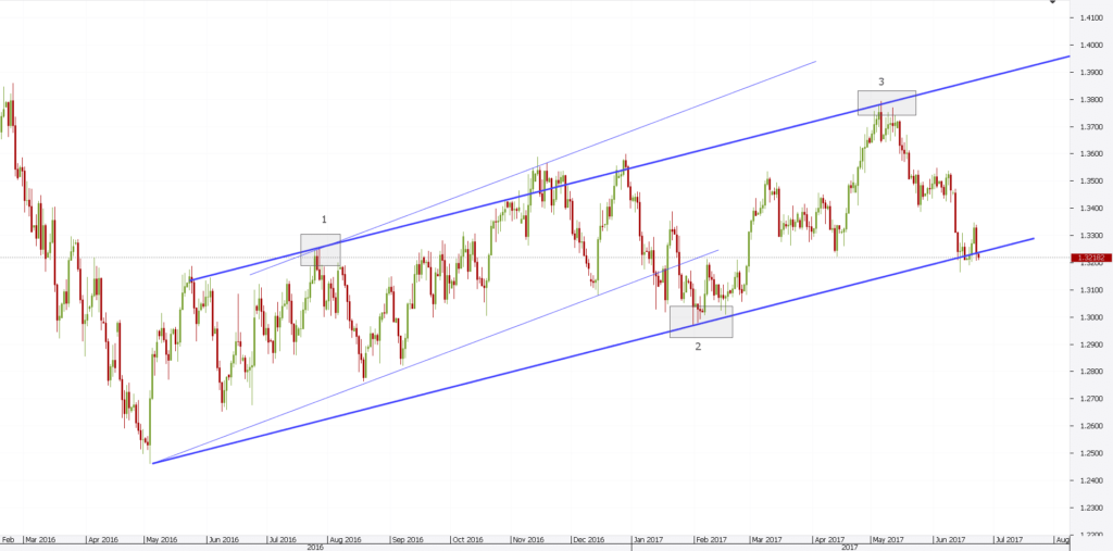
Support Level: This level signifies a price range buyers regard as favourable for purchasing the security. As the asset’s price approaches this range, an increase in buying activity can lead to a potential reversal in its downward movement or a temporary halt in its decline.
Resistance Level: On the contrary, the resistance level marks a price range at which sellers view the asset as sufficiently valued to initiate selling. As the price nears this range, a surge in selling pressure may cause a reversal in its upward trajectory or a momentary pause in its ascent.
Incorporating support and resistance levels into algorithmic trading strategies can help in anticipating price reversals or identifying potential entry and exit points. These levels can serve as guidelines for setting stop-loss orders, take-profit targets, and other parameters of a trading algorithm. One tool that can aid in approximating these price ranges is K-Means Clustering.
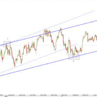
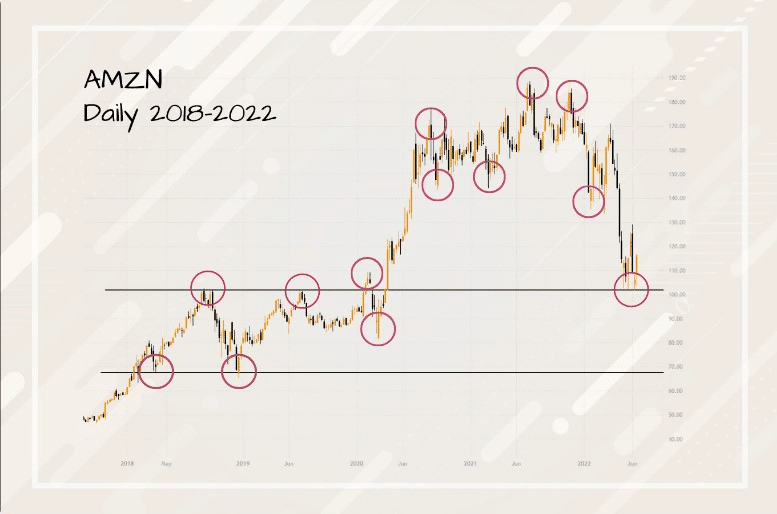
A real-world example of this is shown in the diagram below:
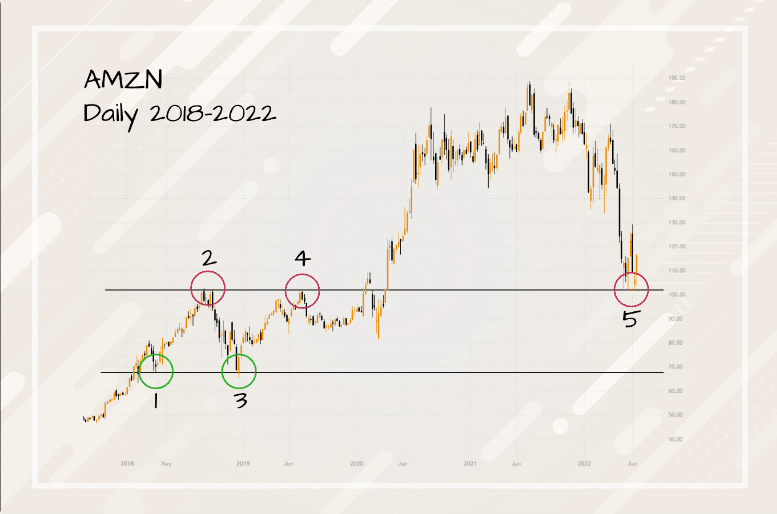
Figure 1 illustrates an example of support and resistance lines being respected. However, in actual trading, price behaviour does not always adhere strictly to these lines. Support and resistance levels are theoretical price points suggesting where the market might experience a change in its direction, depending largely on the balance of power between buyers and sellers.
What is K-Means Clustering?
K-Means is a method of clustering data points into predetermined number of clusters, K. The algorithm works by assigning each data point to the nearest centroid, and then recalculating the centroid as the mean of the points in that cluster. The process repeats until the centroids no longer change significantly. Essentially, it groups together points that are close to each other in the dataset. In the context of financial data, K-Means can be employed to partition price data into distinct groups. The boundaries of these groups can potentially be interpreted as support and resistance levels.
Understanding the problem:
In trading, support and resistance levels play a crucial role in forecasting potential price reversals and continuations. There are various forms of these levels to consider. For instance, support and resistance can be horizontal (where price hits a consistent level multiple times) or diagonal (often following trendlines). They can be categorized based on duration into long-term and short-term levels, and based on their strength into major and minor levels. In this article, our primary focus will be on understanding and identifying horizontal short-term support and resistance levels, given their importance in short-term trading strategies.
Finding Support and Resistance Levels Using K-Means Clustering
Obtaining Historical Data with YFinance:
Before diving into the clustering, we need quality historical data. For this, we turn to YFinance, a Python module that provides a straightforward means to fetch financial data from Yahoo Finance.
Why YFinance?
- It’s cost-effective, offering vast amounts of financial data entirely for free.
- Simplicity is at its core, making it an accessible tool for both novice and experienced developers.
- The data retrieved is reliable, coming from the trusted platform of Yahoo Finance.
To use YFinance, one would typically start by installing it typically done vai pip:
pip install yfinanceNext, we fetch historical data:
import yfinacne as yf

df = yf.download('AAPL', interval ='1m', period = '1d')

# Output
[*********************100%***********************]  1 of 1 completed
                                 Open        High         Low       Close   Adj Close   Volume
Datetime
2023-09-08 09:30:00-04:00  178.350006  179.179993  178.330002  179.129898  179.129898  2707568
2023-09-08 09:31:00-04:00  179.100006  179.149994  178.684006  178.865005  178.865005   408921
2023-09-08 09:32:00-04:00  178.870102  179.279007  178.830002  179.095001  179.095001   323518
2023-09-08 09:33:00-04:00  179.100006  179.199997  178.970001  179.113297  179.113297   367338
2023-09-08 09:34:00-04:00  179.089996  179.600006  179.070007  179.198807  179.198807   512743
...                               ...         ...         ...         ...         ...      ...
2023-09-08 11:02:00-04:00  178.869995  179.179993  178.835007  179.115005  179.115005   215710
2023-09-08 11:03:00-04:00  179.119995  179.199997  178.979996  178.991302  178.991302   193957
2023-09-08 11:04:00-04:00  179.000000  179.100006  178.869995  178.879700  178.879700   175687
2023-09-08 11:05:00-04:00  178.869995  178.919998  178.824997  178.860001  178.860001   161368
2023-09-08 11:06:00-04:00  178.869995  178.869995  178.869995  178.869995  178.869995        0

[96 rows x 6 columns]As you might have noticed there is a problem. For a standard trading day with data sampled every minute, we would indeed anticipate 390 rows of data, corresponding to the 6.5-hour duration from 9:30 AM to 4:00 PM. However, the output reveals only 96 rows.
To clarify this anomaly I checked the size of the DataFrame.
df.shape

# Output
(389, 6)We can see that we have the correct number of rows given that the data starts at 9:30 and ends at 15:59. When working in environments like Jupyter Notebook, large DataFrames often get truncated to make the output more readable and concise. This truncation is merely for display purposes and doesn’t affect the actual data or its structure.
Understanding DataFrame:
Before we dive deeper, let’s take a moment to understand the data we’re working with. Our DataFrame features six columns, each telling its own tale:
- DateTime: A timestamp, detailing when each data point was captured.
- Volume: Indicates how many shares were traded during that minute.
- Price Data:
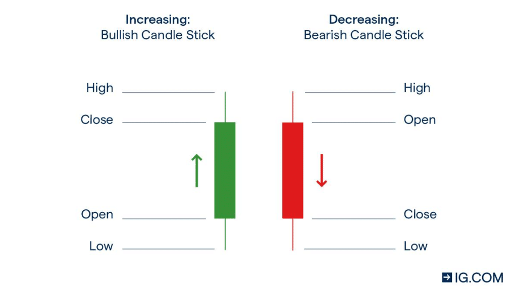
- Open: The price at which the stock began in that minute.
- Close: The price at which it ended.
- High: The peak price during that minute.
- Low: The lowest dip.
- Adjusted_Price: This is often an adjusted close price accounting for factors like dividends and stock splits.
Below, I’ve included a candlestick illustration to visualize these price points. It’s a nifty tool that condenses all this information into a simple visual. Give it a glance, and it’ll soon be second nature to read!
Perform KMeans clustering analysis
When examining price action, there are primarily two methods of clustering:
- Clustering using the close prices.
- Clustering based on the peaks and troughs in the price data.
While the first method is more straightforward, it often results in less accurate support and resistance levels.
To employ the straightforward method, we first extract the close prices:
pip install scikit-learnprices = df['Close'].values.reshape(-1,1)With the data at hand, we can then calculate the K clusters:
from sklearn.cluster import KMeans

kmeans = KMeans(n_clusters=2)
kmeans.fit(prices)

cluster = kmeans.predict(prices)

# Output
array([1, 0, 1, 1, 1, 1, 1, 1, 1, 1, 1, 1, 1, 1, 1, 1, 1, 1, 1, 1, 1, 1,
       1, 1, 1, 1, 1, 1, 1, 1, 1, 1, 1, 1, 1, 1, 1, 1, 1, 1, 1, 1, 1, 1,
       1, 1, 1, 1, 1, 1, 1, 1, 1, 1, 1, 1, 1, 1, 1, 1, 1, 1, 1, 1, 1, 1,
       1, 1, 1, 1, 1, 1, 1, 1, 1, 1, 1, 1, 1, 1, 1, 1, 1, 1, 1, 1, 1, 1,
       1, 1, 0, 1, 1, 0, 0, 0, 0, 0, 0, 0, 1, 1, 1, 1, 1, 1, 1, 1, 1, 1,
       1, 1, 1, 1, 1, 1, 1, 1, 1, 1, 1, 1, 1, 1, 1, 1, 1, 1, 1, 1, 1, 1,
       1, 1, 1, 1, 1, 1, 1, 1, 1, 1, 1, 1, 1, 1, 1, 1, 1, 1, 1, 1, 1, 1,
       1, 1, 1, 1, 1, 1, 1, 1, 1, 1, 1, 1, 1, 1, 1, 1, 1, 1, 1, 1, 1, 1,
       1, 1, 1, 1, 1, 1, 1, 1, 1, 1, 1, 1, 1, 1, 1, 1, 1, 1, 1, 1, 1, 1,
       1, 1, 1, 1, 1, 1, 1, 1, 1, 1, 1, 1, 1, 1, 1, 1, 1, 1, 1, 1, 1, 1,
       1, 1, 1, 1, 1, 1, 1, 1, 1, 1, 1, 1, 1, 1, 1, 1, 1, 1, 1, 1, 1, 1,
       1, 1, 1, 1, 1, 1, 1, 1, 1, 1, 1, 1, 1, 1, 1, 1, 1, 1, 1, 1, 1, 1,
       1, 1, 1, 1, 1, 1, 1, 1, 1, 1, 1, 1, 1, 1, 1, 1, 1, 1, 1, 0, 0, 0,
       0, 1, 1, 0, 1, 1, 1, 1, 1, 0, 1, 0, 0, 0, 0, 0, 0, 0, 1, 1, 0, 0,
       0, 0, 0, 0, 0, 0, 0, 0, 0, 0, 0, 0, 0, 0, 0, 0, 0, 0, 0, 0, 0, 0,
       0, 0, 0, 0, 0, 0, 0, 0, 0, 0, 0, 0, 0, 0, 0, 0, 0, 0, 0, 0, 0, 0,
       0, 0, 0, 0, 0, 0, 0, 0, 0, 0, 0, 0, 0, 0, 0, 0, 0, 0, 0, 0, 0, 0,
0, 0, 0, 0, 0, 0, 0, 0, 0, 0, 0, 0, 0, 0, 0])Cluster Visualisation:
To visualize the clusters, you’ll need matplotlib:
pip install matplotlibplt.figure(figsize=(14,7))
plt.scatter(x=data.index, y=prices, c=clusters, cmap='rainbow', s=20)
plt.title(f"price k-means clusters for {ticker}")
plt.show()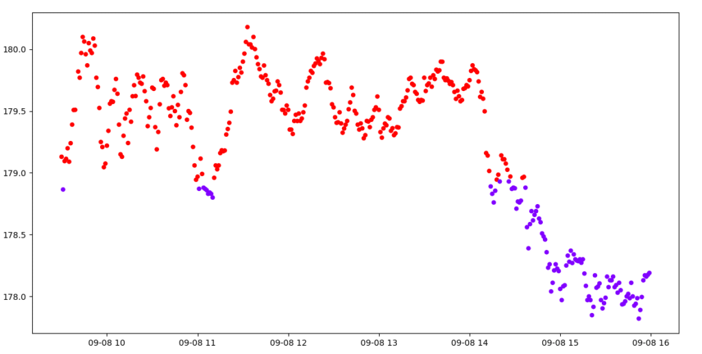
In the diagram above, K-means clustering is used to segment AAPL’s closing prices into two distinct clusters. The red cluster, visible above a particular threshold, distinctly shows instances where the price touches and then rebounds—signifying a robust support level. On the other hand, the purple cluster depicts moments when the price penetrates this support, signalling potential shifts in market sentiment.
Clustering in this manner can sometimes capture unnecessary data points, which might lead to inaccuracies in the identified support and resistance levels. For a more precise approach, one might consider another method that we’ll delve into next.
Clustering with peaks and troughs
To dive deeper into stock price analysis, we often look beyond just the regular closing prices. One effective method involves focusing on the peaks (or local maxima) and troughs (or local minima) in the price data. Why are these points significant? They represent pivotal moments where the stock price is either resisted from rising further (at peaks) or supported from falling further (at troughs). These moments can serve as indicators for potential support or resistance levels in the stock’s movement.
Data processing:
In technical analysis, local peaks and troughs are instrumental in understanding potential points of reversals or continuations of trends. They act as subtle hints, suggesting where the price might find a hard time moving above (resistance) or below (support). These are the points where the market sentiment might be changing, making them particularly valuable for traders.
data['Peak'] = data['High'].where((data['High'] > data['High'].shift(1)) &
                                  (data['High'] > data['High'].shift(-1)), np.nan)
data['Trough'] = data['Low'].where((data['Low'] < data['Low'].shift(1)) &
(data['Low'] < data['Low'].shift(-1)), np.nan)In the provided code snippet, we’re identifying local peaks and troughs within a dataset of stock prices. Utilizing pandas’ where method, for the ‘Peak’ column, we pinpoint locations in the ‘High’ column where the current value surpasses both its previous and succeeding values, indicating a local maximum or peak. Conversely, for the ‘Trough’ column, we locate spots in the ‘Low’ column where the current value is lower than its adjacent values, denoting a local minimum or trough. Values that don’t meet these criteria are replaced with NaN, ensuring that only significant points are highlighted in our data.
As you can see, some peak represents a point where the price faced resistance and pulled back, while some trough indicates a point where the price found support and bounced back. Recognizing these patterns and understanding their implications can be a game-changer in stock trading strategies.
Visualise this data:
plt.figure(figsize=(14,7))
plt.plot(data.index, data['Close'], label='close', color='blue')


# Overlaying the identified peaks and troughs
plt.scatter(data.index, data['Peak'], marker= '^', color='green', label='Peaks', s=50)
plt.scatter(data.index, data['Trough'], color='red', marker='v', label='Troughs', s=50)

plt.title('Stock Price with Identified Peaks and Troughs')
plt.xlabel('Date')
plt.ylabel('Price')
plt.legend()
plt.grid(False)
plt.tight_layout()
plt.show()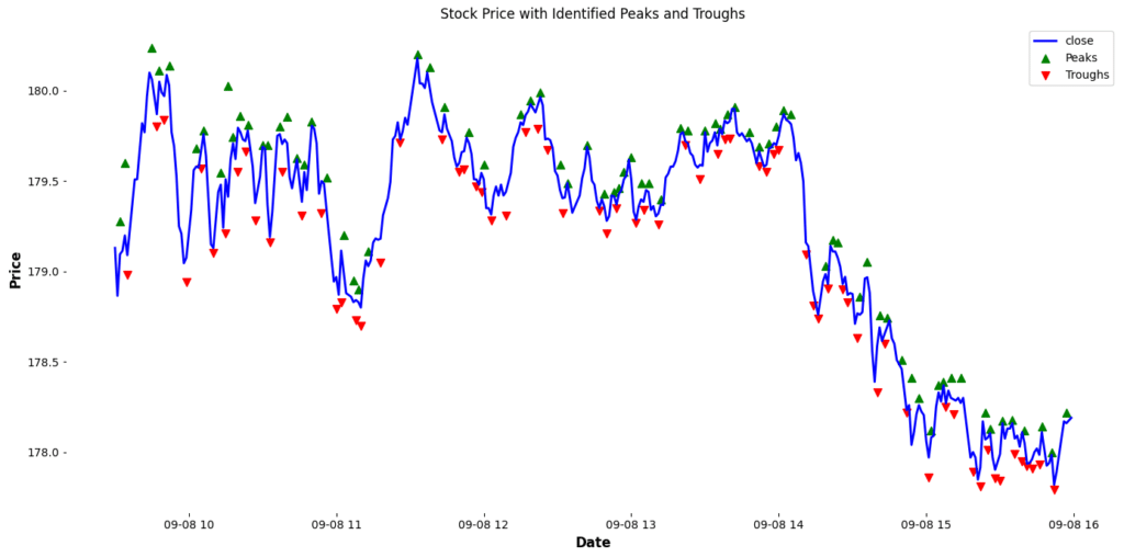
This Graph can be better represented with candle sticks. One way to Visualise candle sticks in Python is using the mplfinance package. The mplfinance (matplotlib finance) package allows for easy visualization of financial data and the creation of candlestick charts, with a range of customization options and features. It’s an offshoot of the older matplotlib.finance module, revamped and enhanced to enable users to craft intuitive and visually appealing financial plots with just a few lines of code. We can use this package as shown below:
!pip install mplfinance

# Create the additional plots

ap1 = mpf.make_addplot(data['Peak'], type='scatter', markersize=100, marker='^', color='red', label='Peak')
ap2 = mpf.make_addplot(data['Trough'], type='scatter', markersize=100, marker='v', color='blue', label='Trough')


# Plot everything together
mpf.plot(data, type='candle', style='charles',
         title=f'{symbol} Candlestick Chart',
         ylabel='Price',
         addplot=[ap1, ap2],
         volume=True,
         figsize=(20,7))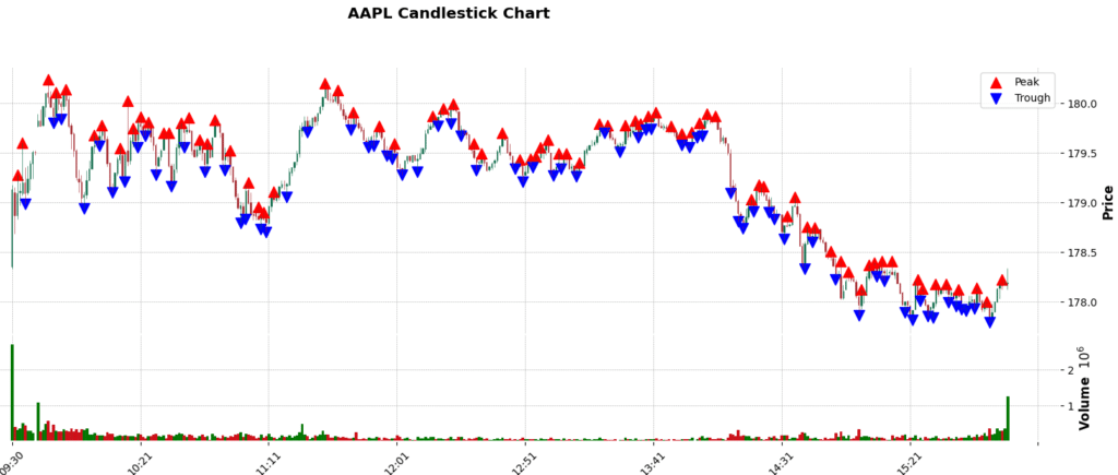
Next, we will combine the peaks and troughs values and perform KMeans clustering.
import pandas as pd# Identify peaks and troughs (example logic)
combined_ = [peak if pd.notna(peak) else trough for peak, trough in zip(data['Peak'], data['Trough']) if pd.notna(peak) or pd.notna(trough)]
combined_ = np.array(combined_).reshape(-1, 1)
combined = [peak if pd.notna(peak) else trough for peak, trough in zip(data['Peak'], data['Trough'])]
kmeans = KMeans(n_clusters=2)
kmeans.fit(combined_)
clusters = kmeans.predict(combined_) # predict the clusters.
print(clusters)
aligned_clusters = []
count = 0
for i in combined:
if pd.notna(i):
aligned_clusters.append(clusters[count] if count < len(clusters) else np.nan)
count += 1
else:
aligned_clusters.append(np.nan)
aligned_clusters = np.array(aligned_clusters).reshape(-1, 1)
# Output
[*********************100%%**********************] 1 of 1 completed
[0 0 0 0 0 0 0 0 1 0 0 0 0 0 0 0 0 0 0 0 0 0 0 0 0 0 0 0 0 0 0 0 0 0 1 1 0
1 1 1 1 0 0 0 0 0 0 0 0 0 0 0 0 0 0 0 0 0 0 0 0 0 0 0 0 0 0 0 0 0 0 0 0 0
0 0 0 0 0 0 0 0 0 0 0 0 0 0 0 0 0 0 0 0 0 0 0 0 0 0 0 0 1 1 0 1 0 0 1 1 1
1 0 1 1 1 1 1 1 1 1 1 1 1 1 1 1 1 1 1 1 1 1 1 1 1 1 1 1 1 1 1 1 1 1 1 1 1]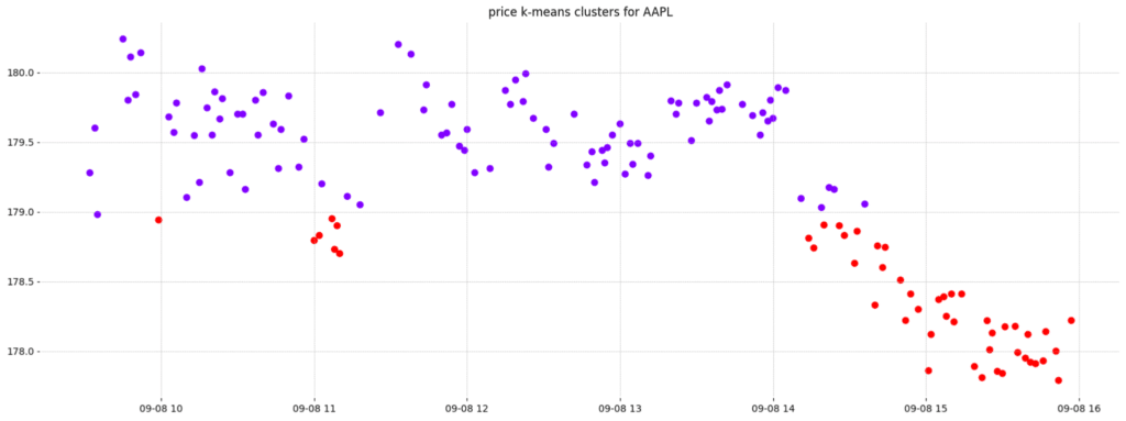
By focusing on clustering the local maximum and minimum data points within the stock price, we are able to drastically reduce the number of data points under consideration during the clustering process. This approach allows for a more precise identification of support and resistance levels, as we account for the entire price range of the stock during each period. This is preferable to solely relying on the closing price, which might not always capture the full volatility or trading range of the stock.
Calculating the Support and resistance levels
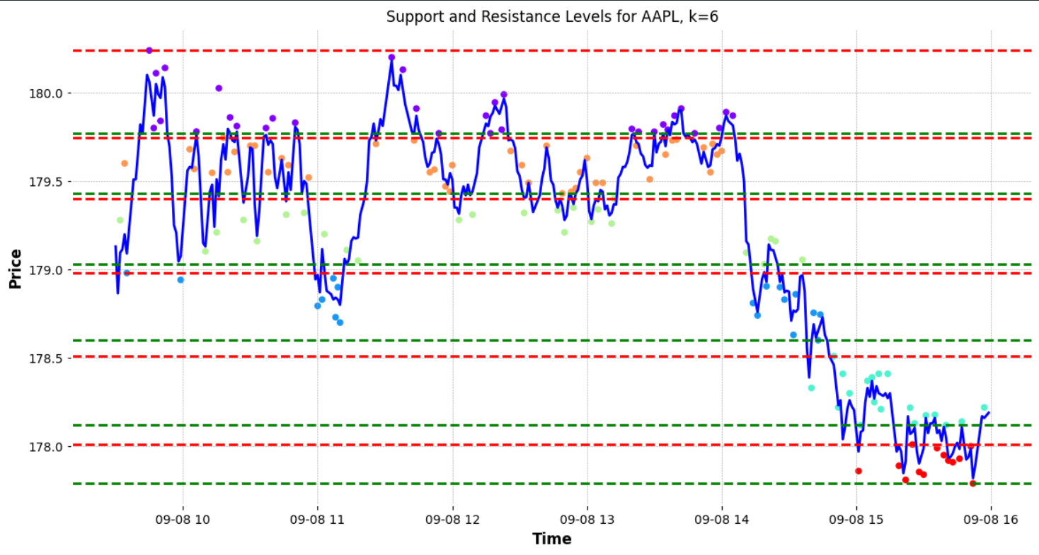
We can plot the support and resistance lines by finding the max and the min price of each cluster, with the max value indicating the highest point in the cluster as a potential resistance level and the min point indicating a point of potential support.
k = 2
min_max = {}
for i in range(k):
    min_max[i] = [np.min(combined_[clusters==i]), np.max(combined_[clusters==i])]
print(min_max)

plt.figure(figsize=(14,7))
plt.plot(data['Close'], label="Price Action", color='blue')
for i in range(k):
    plt.axhline(y=min_max[i][0], color="g" , linestyle='--', label=f"Min Level {i+1}")
    plt.axhline(y=min_max[i][1], color="r" , linestyle='--', label=f"Max Level {i+1}")
plt.scatter(x=data.index, y=combined, c=aligned_clusters, cmap='rainbow', s=20)
plt.title(f"Support and Resistance Levels for AAPL")
plt.xlabel("Time")
plt.ylabel("Price")
plt.legend()
plt.grid(True)
plt.show()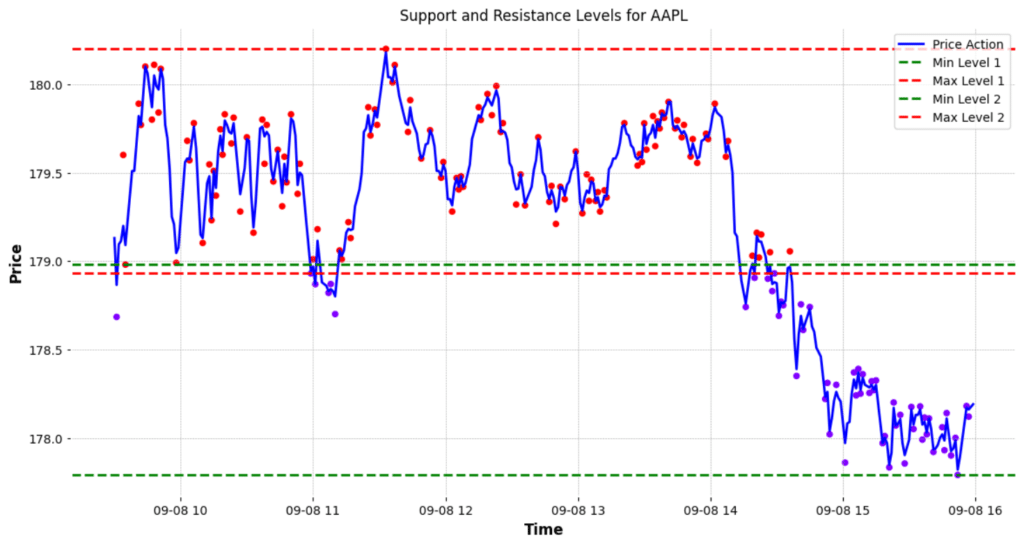
We can see that there is a subtle gap between one cluster’s support and another’s resistance. One can consider removing these gaps by finding the average of these to price levels, but I like to keep these as they represent zones of price support or resistance, many traders use rectangles instead of lines to denote their potential support and resistance levels during technical analysis.
Going Further:
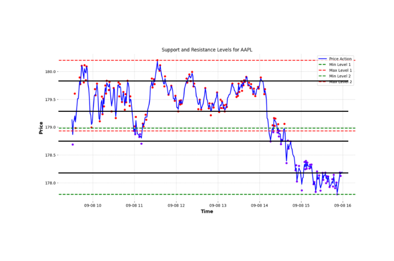
These lines are not the only support and resistance levels on the chart. The figure below points out additional support and resistance levels that the algorithm did not identify. These levels, while evident to a human observer, can be extremely valuable when planning trades. For instance, these additional lines can be used to set multiple take-profit points for traders who prefer to exit a portion of their position incrementally.
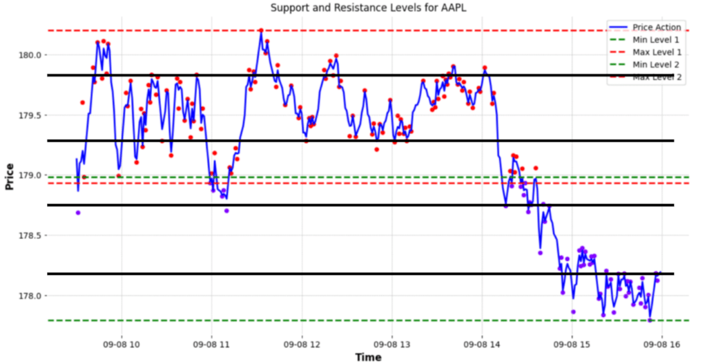
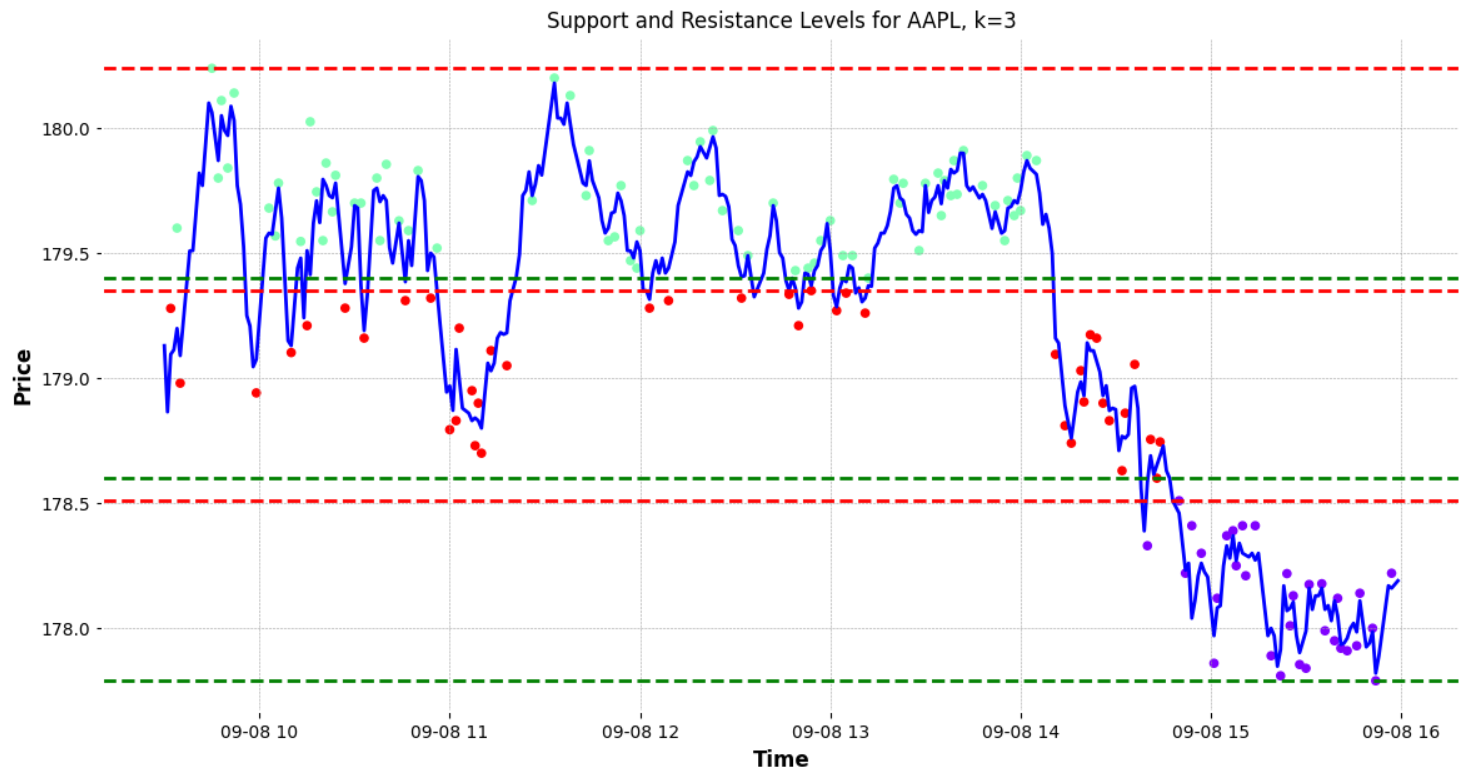
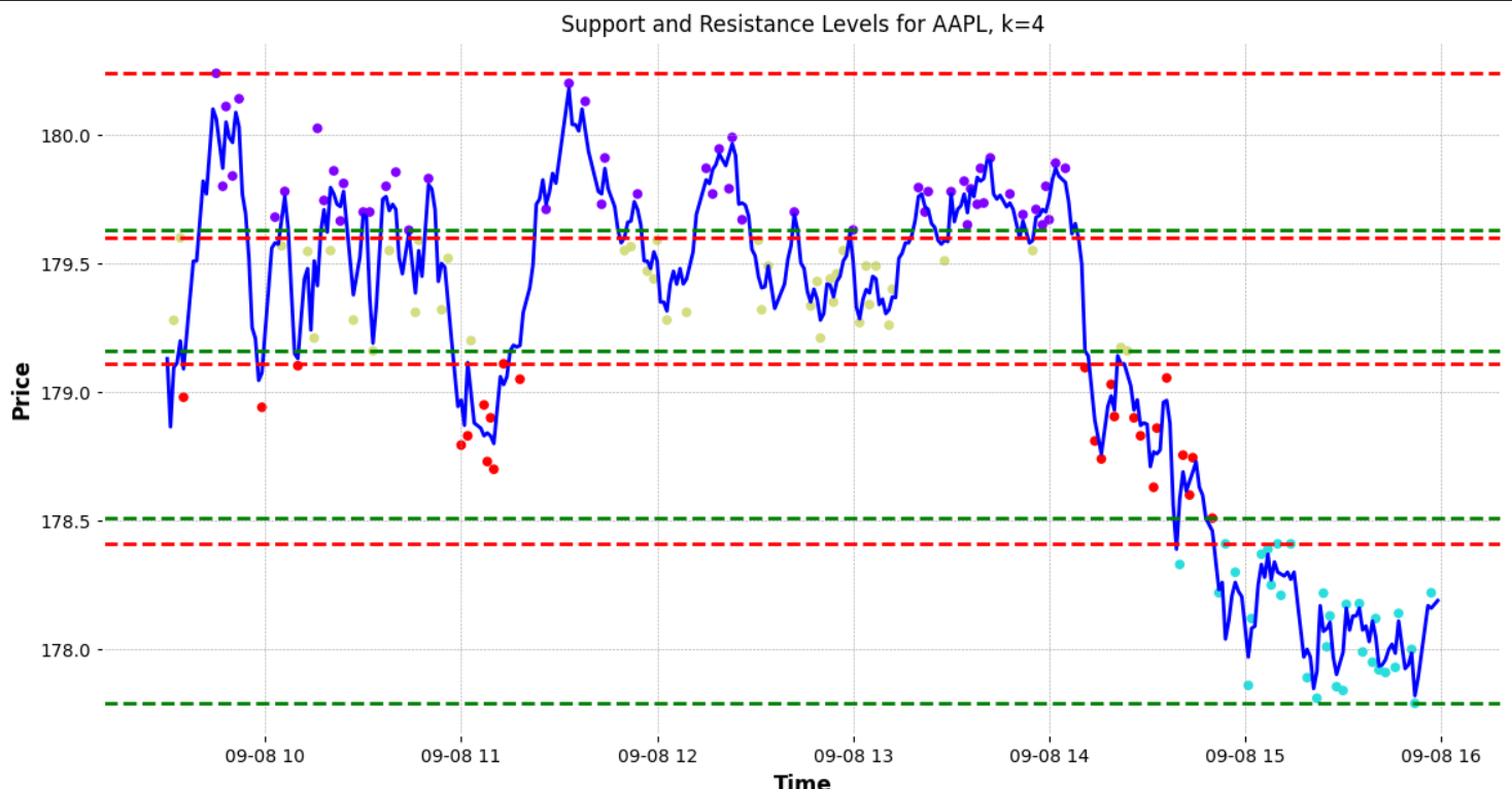
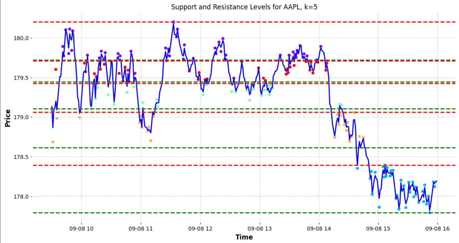
To enhance the accuracy of identifying these levels, one could consider increasing the number of clusters. By adding more clusters, the algorithm might pinpoint a greater number of support and resistance levels.
However, it’s important not to do this haphazardly. Instead, an algorithmic approach to determining the optimal number of clusters is desirable. One popular method to ascertain the best ‘K’ (number of clusters) for the data is the “elbow method.”
What is the Elbow method?
The “elbow method” is a technique used to determine the optimal number of clusters in k-means clustering. By running the clustering algorithm for various values of k (the number of clusters), one calculates the sum of squared distances from each point to its designated centre. When these values are plotted, the point where the reduction in variance slows down, forming an “elbow” in the graph, indicates an optimal number for k. This point represents a balance between precision and computational cost. However, the choice of clusters can also be influenced by domain knowledge and specific business needs.
def optimal_k(ticker , interval, period ):
    # Sample data
    data =  yf.download(ticker, interval=interval, period=period)['Close'].values.reshape(-1, 1)

    # Calculate the sum of squared distances for different k values
    sse = []
    list_k = list(range(1, 10))

    for k in list_k:
        km = KMeans(n_clusters=k)
        km.fit(data)
        sse.append(km.inertia_)

    # Normalize the curve
    x = np.arange(1, len(sse) + 1)
    y = np.array(sse)
    y_norm = (y - y.min()) / (y.max() - y.min())

    # Compute the distance of each point from the line connecting (1, sse[0]) and (len(sse), sse[-1])
    distances = []
    for i in range(len(y_norm)):
        p = np.array([x[i], y_norm[i]])
        a = np.array([1, y_norm[0]])
        b = np.array([len(sse), y_norm[-1]])
        distance = np.abs(np.cross(p-a, b-a)/np.linalg.norm(b-a))
        distances.append(distance)

    # Get the optimal number of clusters
    optimal_k = distances.index(max(distances)) + 1

    # Plot sse against k
    plt.figure(figsize=(6, 6))
    plt.plot(list_k, sse, '-o')
    plt.axvline(x=optimal_k, color='red', linestyle='--')
    plt.xlabel('Number of clusters k')
    plt.ylabel('Sum of squared distance')
    plt.show()

    return optimal_k

k = optimal_k(ticker , interval, period )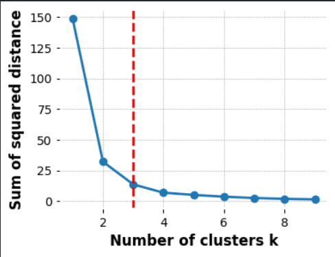
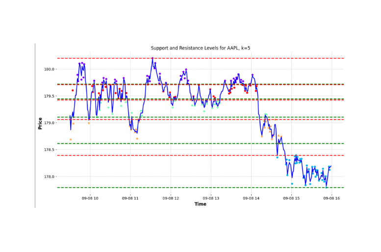
In our case, the unique characteristics of our data—affected by price fluctuations—might cause the “elbow” to manifest a level or two below our ideal count. Such price variations can lead to essential support and resistance levels being overlooked. Let’s not forget: our primary goal is to enhance the identification of these crucial price levels within our data set. Hence, we aren’t just stopping at the elbow’s suggestion. Instead, we’re tactically adding to the optimal k to maximize these crucial price-level identifications. In essence, while the elbow guides, our mission refines the direction.
k = optimal_k(...) + 2Given these modifications we can use the new k value to identify our support and resistance level. The identified support and resistance levels above are surprisingly close to the line we manually identified earlier; below is a side by side comparison:
Conclusion:
In conclusion KMeans is an intriguing approach to augment traditional technical analysis. Over longer time frames, K-means clustering demonstrates a commendable aptitude in determining these levels. When compared with manually identified benchmarks however, during intraday scenarios (from 9:30 AM to 4:00 PM), the automated approach offers proximate but not exactly overlapping results.
However, its precision seems to diminish when applied to intraday trading or “scalping”. This discrepancy between automated and manually identified levels might arise from the methodology of selecting maximum and minimum values within clusters. Such an approach may not capture the true dynamics of intraday trading.
Potential refinements could include a deeper dive into cluster analyses. One such solution might involve refining the granularity of the clusters, subdividing continuously until minimal variance is observed within a cluster. Additionally, transforming the chart data into a one-dimensional plane with respect to price could pinpoint more precise support and resistance zones by examining data point density and proximity.
While K-means clustering offers promising results for longer-term financial charting, its application for intraday scenarios needs further refinement.

